Typography
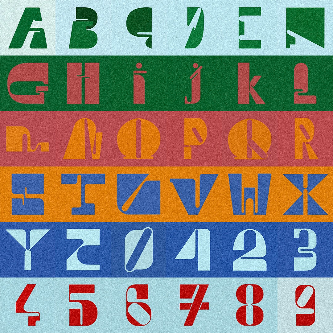
Developed for the 360 Days of Type challenge, this alphabet explores the contrast between condensed and expanded letterforms, seeking a balanced relationship between narrow and wide shapes.


Developed for the 360 Days of Type challenge, this alphabet explores the contrast between condensed and expanded letterforms, seeking a balanced relationship between narrow and wide shapes.